HubSpot Self-Service Style Guide
Project
In 2017, the HubSpot Self-Service team had a set of loose guidelines for technical writing, help documentation, and educational material—but no formal style guide. As a result, there were clear differences in the structure, voice, and style across the self-service and learning platforms, and content as a whole was largely inconsistent and unfocused.
With the team and product rapidly expanding, we developed a formal and comprehensive style guide that the team could use to write clear and consistent educational content.
Strategy
Educational content for HubSpot must be written to serve a wide spectrum of users. When the HubSpot Knowledge Base first began, it was aimed at the persona Marketing Michelle, a career marketer with 7+ years of experience managing a team, typically at a scaleup.
With the introduction of the HubSpot CRM, Sales Hub, and Service Hub, there was no longer one primary persona – Marketing Michelle was now joined by Growth Gary, Sales Leader Larry, and Account Rep Alex, all of whom had different career experiences, roles, and expectations.
With this in mind, we decided to move away from targeting any one specific persona, and instead create a set of style guidelines to ensure that educational content would accommodate a wide range of users and their objectives – whether they were a marketer or sales rep, and had been using HubSpot for two days or two years.
We took reference from the Microsoft Style Guide and Write the Docs' Documentation Guide, as well as HubSpot’s own written style guide, to develop a comprehensive style guide for the HubSpot Academy and Knowledge Base.
We kept a strong focus on keeping our style guidelines action-oriented: allowing users to quickly find what they needed, structuring documentation around user actions, and using the active voice.
|
How do I promote content with |
Create and publish social posts |
||
|
This notification center lets you be notified of new product updates. |
Use the notification center to keep track of new product updates. |
||
|
After the note has been added, |
After you’ve added a note, click Save. |
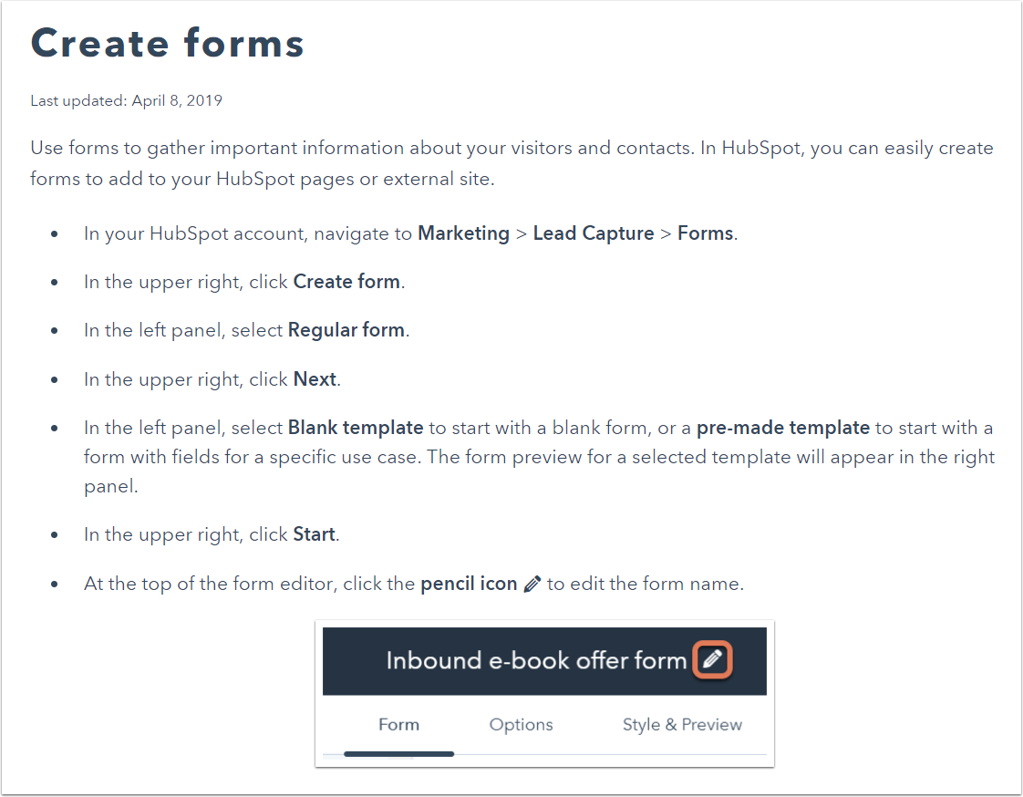
Another key change was standardizing the terminology for HubSpot UI elements, such as ‘dialog box’, ‘panel’, and ‘dropdown menu’, and giving users directional cues before asking them to take a specific action. This was important in ensuring that users could expect to see the same language used across different help articles.
|
Click the Create form button in the upper right. |
In the upper right, click Create. |
||
|
Click the Sales dropdown on the right-hand side. |
In the right panel, click the Sales dropdown menu. |
With clear and consistent instructions and directional cues, we were also able to reduce our reliance on screenshots, which take up space in an article, make it harder to scan for keywords, and are difficult to maintain. Instead, screenshots would be used only to depict elements that might be harder to find, or where a visual representation of elements would make a process easier to understand.
To improve the searchability of our documentation in line with SEO best practices, we introduced a guideline for hyperlink anchor text to be descriptive and relevant to the target page, instead of generic text or placeholders such as 'here'.
|
Click here to learn about contact-based workflow types. |
Learn more about contact-based workflow types. |
||
|
If you haven't connected your social accounts to HubSpot, click here to do so before continuing. |
If you haven't connected your social accounts to HubSpot, set them up first before continuing. |
||
|
To find out more, review HubSpot's pricing page. |
Review HubSpot's pricing page for more information. |
Outcome
With the development and implementation of a formal style guide for HubSpot's self-service content, we were able to create a clear, consistent, and simplified help and learning experience for our users.

Before: redundant and inconsistent copy, excessive use of screenshots, hard to scan

After: action-oriented, clear and consistent directional cues, easy to scan